| Author |
Message |
Superquad7
Sgt-L3


Joined: 26 Feb 2010
Post Count: 297
|
  Posted: Sat Jul 07, 2012 11:31 pm Posted: Sat Jul 07, 2012 11:31 pm |


|
|
|
Ok, so I finished another one of these. This is the scene immediately after Alex's death, where Lewis comes up to his body just after the shooting and reacts to everything.
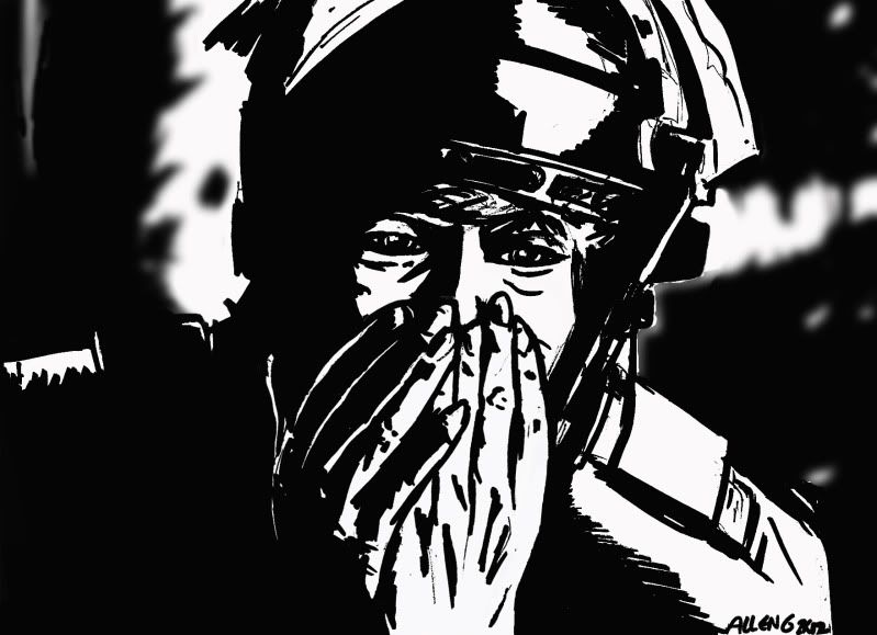
This style of illustration is still working pretty well for me, as it's forcing me to illustrate in a way I'm not used to doing. The style is an awkwardness that is very much welcomed, as it's this aspect that's really pushing me. It's creating a way of seeing that I've not experienced since I was a small boy just learning to draw. It's one of the most liberating things I've done artistically.
At any rate, I hope you enjoy it! More to come![/img]
|
|
 |
|
 |
Josh
Lover Extraordinaire!


Joined: 05 Aug 2006
Post Count: 6443
|
| Posted: Sun Jul 08, 2012 12:12 am |
|
|
|
Again, a good looking piece.
The black and white makes a stark image and the lack of focus in the background is a nice touch and makes the foreground stand out.
The only problem I have with it is Lewis' eyes, they just don't look right. Do you go straight in with pens or do you use pencil first?
|
|
|
|
|
Nika Silwerra
Justified and Ancient of Mu


Joined: 25 Dec 2005
Post Count: 8411
Comment: The queen of RoboCop random finds thread
|
| Posted: Sun Jul 08, 2012 3:26 pm |
|
|
|
Yep. you know, how I am happy to see here some artits and further new drawings.
I noticed you have a talent to work with black and white and shadows, also I like the "Dick Jones is wanted for murder" pict with the bloody red color, nice combination to the your style too .. so keep drawing coz I cannot wait to see next scene done by your style. 
+PT for you.
|
|
|
|
|
Superquad7
Sgt-L3
Joined: 26 Feb 2010
Post Count: 297
|
| Posted: Mon Jul 09, 2012 8:06 pm |
|
|
|
| Josh : | Again, a good looking piece.
The black and white makes a stark image and the lack of focus in the background is a nice touch and makes the foreground stand out.
The only problem I have with it is Lewis' eyes, they just don't look right. Do you go straight in with pens or do you use pencil first? |
Thanks a lot, man!
The background was a big decision for me. Once I pulled this into Photoshop, I decided towards the end of my post production that I'd try this out. The original illustration was not blurred, of course. Doing this made things look very different. I flip-flopped back and forth for a while, and ended up deciding to go this way. The unaltered background was just too harsh and void of contrast.
As for the eyes, you're probably right. With the magic of Photoshop, I think it's something that I could fix easily. What in particular is bothering you about them? I'll come back to it after I have a fresh set of eyes myself.
As for my process, I start with pencils first, then move to inks. My pencils are not quite polished like comic book artwork, for example; they're merely guidelines for inking. With these, I move to a Sharpie marker only, as I want the lines all to be really thick (normally, I'd use a series of ink pens to get fine lines and such, as in the OCP scene illustration). After I get a good, solid image, I scan the image and import it to Photoshop to make any adjustments and such.
| Nika Silwerra : | Yep. you know, how I am happy to see here some artits and further new drawings.
I noticed you have a talent to work with black and white and shadows, also I like the "Dick Jones is wanted for murder" pict with the bloody red color, nice combination to the your style too .. so keep drawing coz I cannot wait to see next scene done by your style.
+PT for you. |
 That means a lot, because this sketchy, bold black style has very much been an experiment of mine with Robocop stuff. I wanted to force myself to go in directions that I would otherwise not go in. It's been fun, and I very much want to do more. That means a lot, because this sketchy, bold black style has very much been an experiment of mine with Robocop stuff. I wanted to force myself to go in directions that I would otherwise not go in. It's been fun, and I very much want to do more.
I can't take a lot of credit for my new siggy, as the Roboartwrok isn't mine. The design of the sig is (placement, text, color, and concept). I'm glad you like it. I've came across (as well as seeing some of the "finds" you've posted) inspirational pieces for this new venture of mine. I guess it's appropriate that I have one in my siggy
|
|
|
|
|
Josh
Lover Extraordinaire!
Joined: 05 Aug 2006
Post Count: 6443
|
| Posted: Mon Jul 09, 2012 8:47 pm |
|
|
|
| Superquad7 : | | What in particular is bothering you about them? |
There's nothing wrong with them, they just don't look like Lewis' eyes. I think they're a bit wide but a bit slim at the same time.
|
|
|
|
|
Superquad7
Sgt-L3
Joined: 26 Feb 2010
Post Count: 297
|
| Posted: Mon Jul 09, 2012 8:51 pm |
|
|
|
| Josh : | | Superquad7 : | | What in particular is bothering you about them? |
There's nothing wrong with them, they just don't look like Lewis' eyes. I think they're a bit wide but a bit slim at the same time. |
Ah, gotcha! That's pretty helpful, and I'll review the screenshot so I can make adjustments. In this shot, their is a lot of shadows around the eyes (which made it just a tad more difficult to get the emotion from them).
Thanks so much for your comments; I appreciate the helpfulness!
|
|
|
|
|
RoboWags
Ultra Police Watch Commander


Joined: 08 Jul 2012
Post Count: 424
Comment: "Its time to show how real cops kick ass."
|
| Posted: Sat Sep 08, 2012 4:43 am |
|
|
|
I really like what you do with a Sharpie. I think the bold lines really help drive the emotion impact of your sketches.
_________________

|
|
|
|
|
|


 549
549
")
")
")


")
")
")


")
")


