| Author |
Message |
Sin_Valor
No. 4 dumbass on the board

 
Joined: 17 Aug 2013
Post Count: 934
Comment: Don't touch me man!
|
  Posted: Tue Apr 08, 2014 10:29 pm Posted: Tue Apr 08, 2014 10:29 pm |


|
|
|
I've noticed the lack of logotypes taken from the RoboCop games on the archive such as the 2003 Titus game and the fan-made game from Park Productions. There aren't even any logotypes from the arcade games or NES games, so I thought it's time to bring them up and put them in the archive.
I know the games themselves have been mentioned before, but I think we should also add in the titles and the detail from those games into the archive. We already have sprites from the NES games being used as avatars and signatures, we should add more in too.
Anyways, here's the logotype from the R1 arcade game.

This is the logo from the Gameboy Color game.

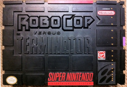
This one's from the RoboCop VS The Terminator game on SNES. It's a bit similar to the Criterion logo.

Here's the same one, but this one's in an actual metal box...or looks like one anyways.
And for no reason, here's the one from the VCR game, because why not?

Anyway, I've had enough finding anymore of these, I give up.
_________________

|
|
 |
|
 |
Sean_001
Vault Dweller

Joined: 20 Mar 2003
Post Count: 2192
|
| Posted: Wed Apr 09, 2014 7:13 pm |
|
|
|
They're all on the main page. Well, most of them.
http://robocoparchive.com
...under the data section.
|
|
|
|
|
Sin_Valor
No. 4 dumbass on the board
Joined: 17 Aug 2013
Post Count: 934
Comment: Don't touch me man!
|
| Posted: Wed Apr 09, 2014 10:33 pm |
|
|
|
Like I said...
| Sin_Valor : | | There aren't even any logotypes from the arcade games or NES games |
I know the commonly used logotypes are on the front covers of the games, but not on the game itself. I'm talking about the in-game logotypes, like the 2nd logotype for the Titus game that was used for ingame menus...as well as being on the box covers for other game platforms.
_________________
|
|
|
|
|
Stan The Man
Bah Concepts Division


Joined: 05 Jun 2003
Post Count: 7020
Comment: I'm the guy in Old Archive.
|
| Posted: Wed Apr 09, 2014 11:27 pm |
|
|
|
Most of the in-game and box cover logos are still just the 'standard' versions with just different color schemes. The R1 NES logo you posted is just a standard logo, non-lined and in full gray (Sorta looks a bit like R2's logo). The only real distinguishable difference is it looks a bit stretched vertically. But all-told it's not like it's truly a 'unique' logo or anything special really.
I think if the site were to feature every RoboCop logo variant it would be a large page that would pretty redundant and sorta pointless - I don't really see what benefit there is to showing a massive amount of logos on the site, when the vast majority of them essentially look the same. I'm sure Archive thinks that way too, otherwise he would have them there already.
_________________
I don't wanna pay that, PhotoBucket. Now maybe you haven't heard, but I'm the guy in old Archive. So hows about you just shit snow for a year and I'll figure out something else. Sayonara!
|
|
|
|
|
Sin_Valor
No. 4 dumbass on the board
Joined: 17 Aug 2013
Post Count: 934
Comment: Don't touch me man!
|
| Posted: Wed Apr 09, 2014 11:37 pm |
|
|
|
| Stan The Man : | | Most of the in-game and box cover logos are still just the 'standard' versions with just different color schemes. The R1 NES logo you posted is just a standard logo, non-lined and in full gray (Sorta looks a bit like R2's logo) Other than that the only real difference is it looks a bit stretched vertically. But all-told it's not like it's truly a 'unique' logo like some others. |
It's actually from the arcade game. I did mention this already on the first post of the thread.

Anyways, I say I'd say this is different from the other common logotypes because it's digitized and pixelated into a game rather than just taking the title, re-colouring and detailing it a bit, and putting it on the cover. Even the logotype from the Marvel cartoon was hand-drawn.
Like I said, I'm including more logotypes from the other games, so please give me some time to include them.
_________________
|
|
|
|
|
Stan The Man
Bah Concepts Division
Joined: 05 Jun 2003
Post Count: 7020
Comment: I'm the guy in Old Archive.
|
| Posted: Wed Apr 09, 2014 11:39 pm |
|
|
|
EDIT -
| Quote: | | Anyways, I say I'd say this is different from the other common logotypes because it's digitized and pixelated into a game rather than just taking the title, re-colouring and detailing it a bit, and putting it on the cover. Even the logotype from the Marvel cartoon was hand-drawn. |
It's digitized and not hand-drawn? Seriously? Bah, I think you're really splitting hairs here. My point still stands. As I said, it's essentially still the same standard logo - I don't see what's so special about it enough to warrant posting it up honestly. I'm afraid most of the rest will be the same thing. We'll see though I guess.
_________________
I don't wanna pay that, PhotoBucket. Now maybe you haven't heard, but I'm the guy in old Archive. So hows about you just shit snow for a year and I'll figure out something else. Sayonara!
|
|
|
|
|
|


")

 2
2


")
")
")
")


")
")
")


")